Problem
Digimune found itself blending into the crowded cybersecurity market, despite offering robust protection against cyber threats. Their existing brand identity did not adequately convey the sophistication and reliability of their software, making it challenging to connect with their target audiences: families in search of safety and business owners requiring secure data exchange. They needed a brand that would promise security and resonate on a personal level, fostering trust and assurance in an increasingly risky digital world.
Solution
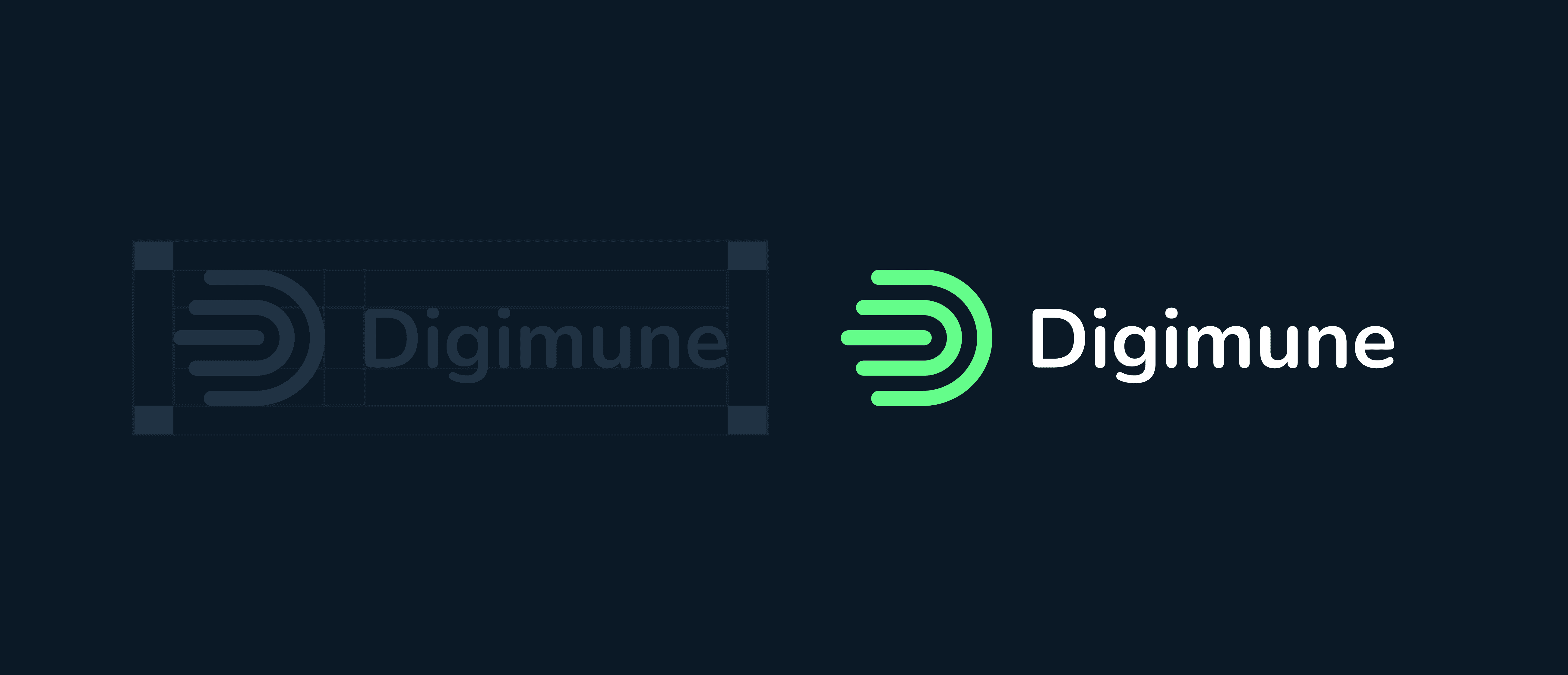
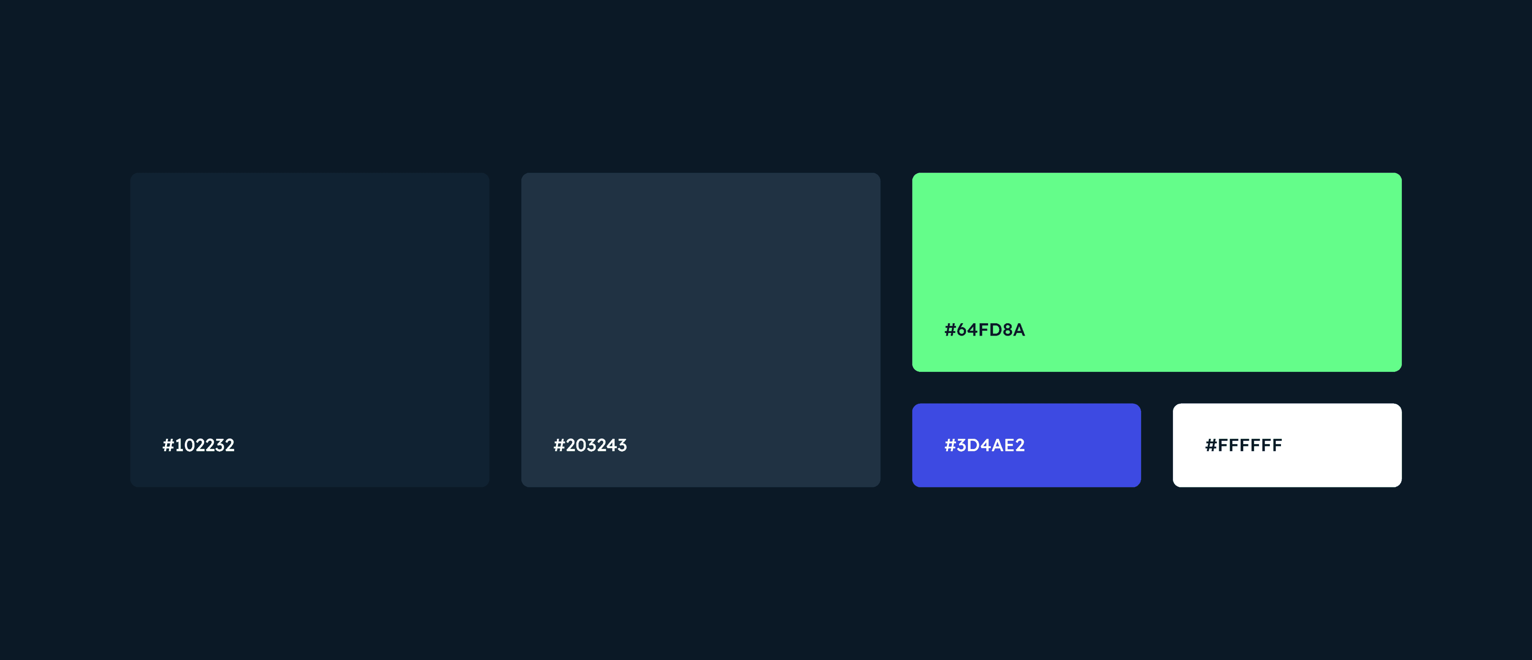
To distinguish Digimune in the cybersecurity market, we redesigned its brand identity, creating a logo that merges the letter 'D' with a stylised thumbprint to symbolise personalised digital protection. The selected colour scheme and typography were chosen to reflect reliability, safety, and user-friendliness, repositioning Digimune as a trusted guardian in the digital space. This strategic update transformed Digimune into a brand that promises and delivers digital safety for both families and business owners, encouraging confident online exploration.

